I'm not an orange
print design soft goods visual system illustration | Spring 2015
A color, form and pattern exploration through soft good production and brand system design.
Graphic translation
We started off experimenting with ways to create graphic translations of fruits and vegetables through different mediums, like graphite, paint, cut paper, etc. I was drawn to the petite size of the tangerine and its vibrant orange color, and began exploring with watercolour and cut paper. I finally arrived at a series of translations using acrylic, since the bright saturated colors and thick textures of the acrylic paint represent the pop of the tangerines better.
Pattern design
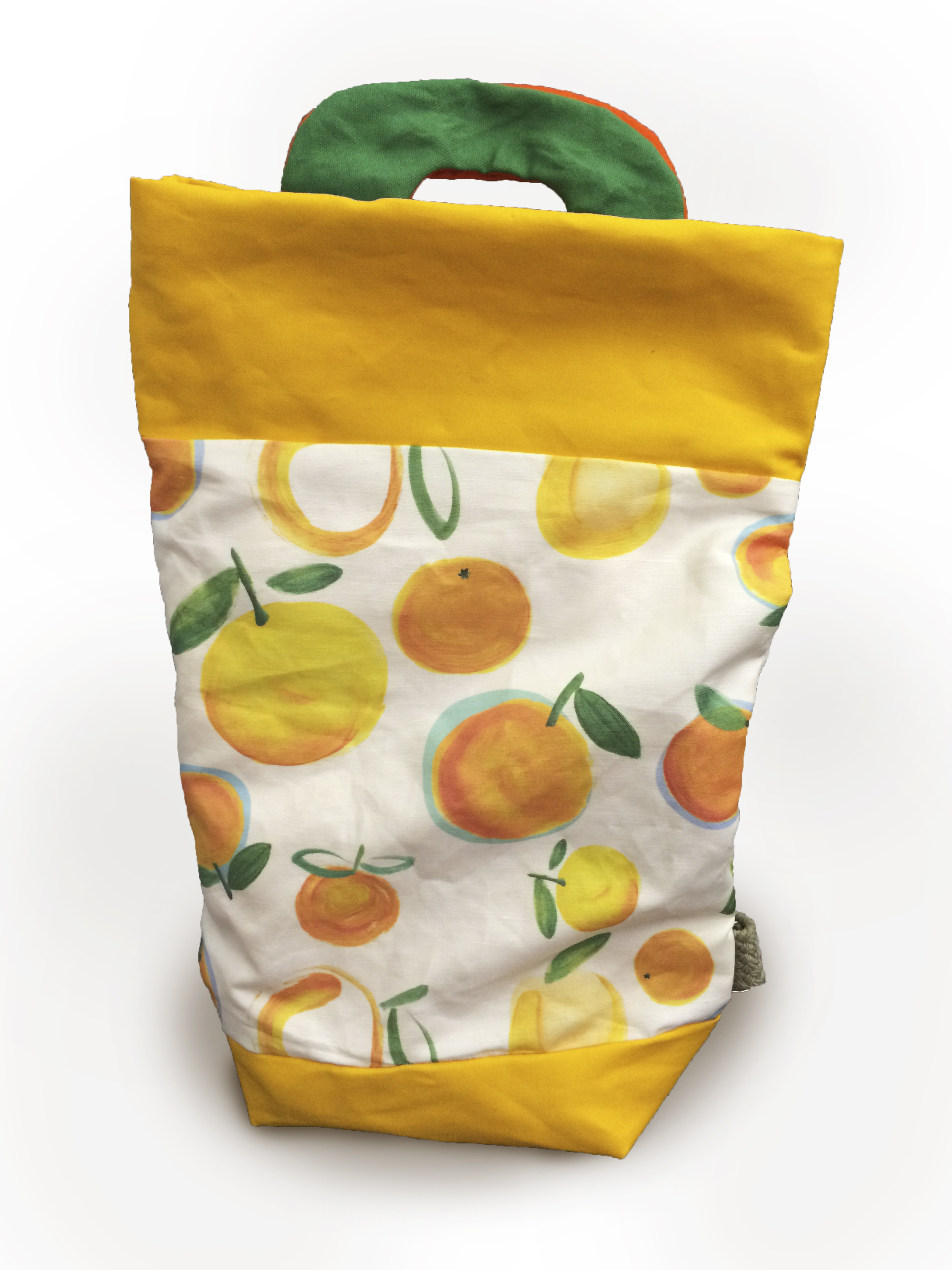
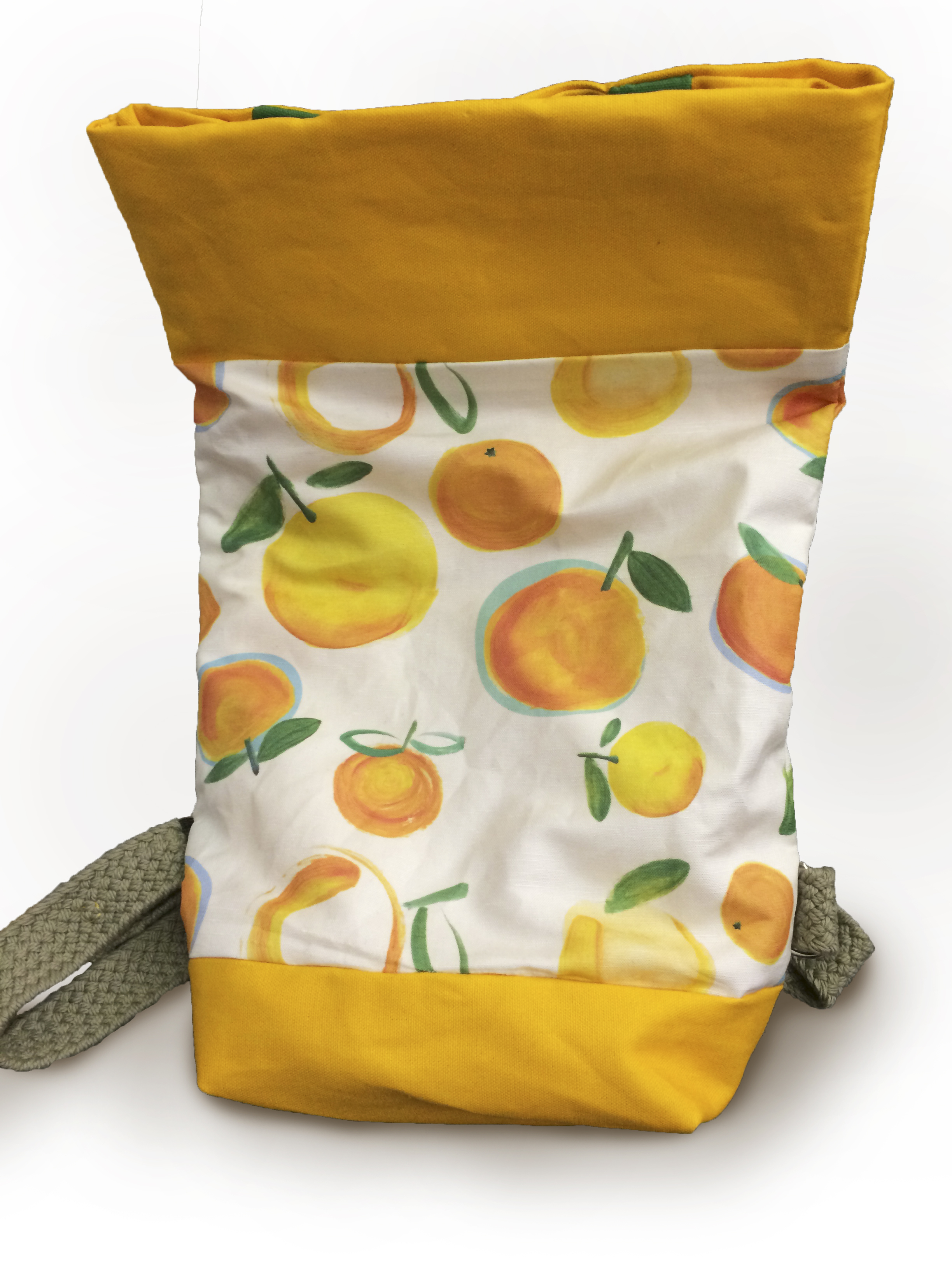
Learning a lot about how contrast, scale, negative space, foreground vs. middle ground vs. background come into play in creating visual gestalt. The proportion between variation and repetition is also crucial. A right amount of variation keeps the pattern interesting without making it overwhelming. I added vector shapes of a light cool blue to contrast the saturated warm colors while adding a middle ground to ease the stark tension between the orange and the green. Negative space between the tangerines are also crucial, since the different tangerines are already visually very busy.
Branding system
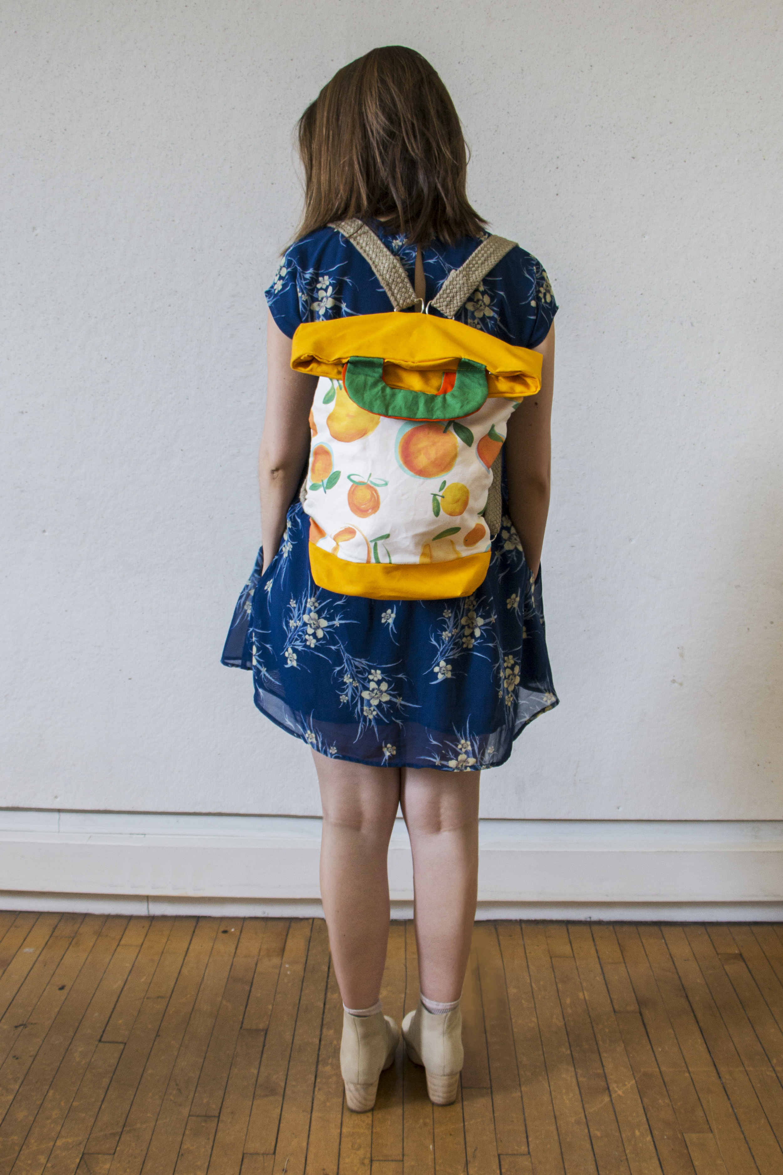
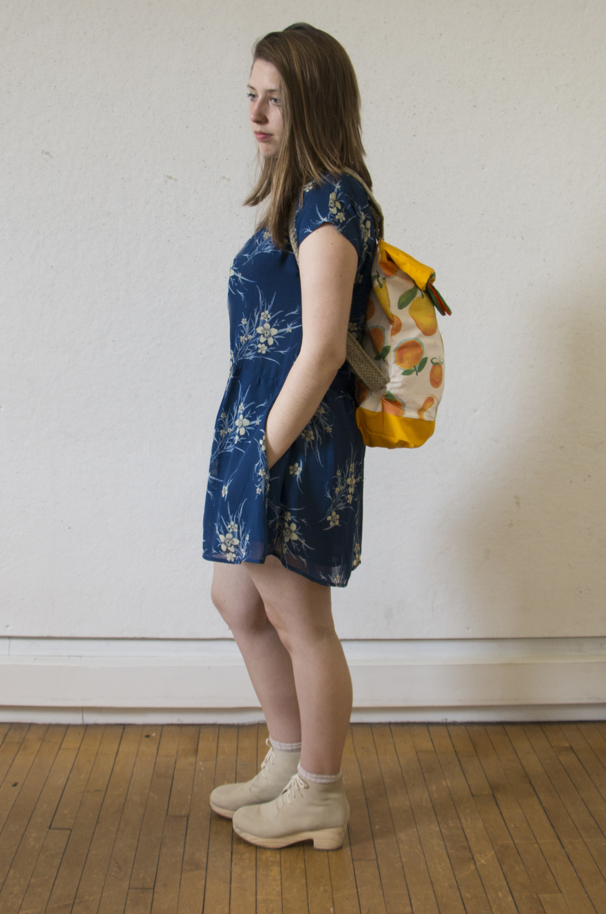
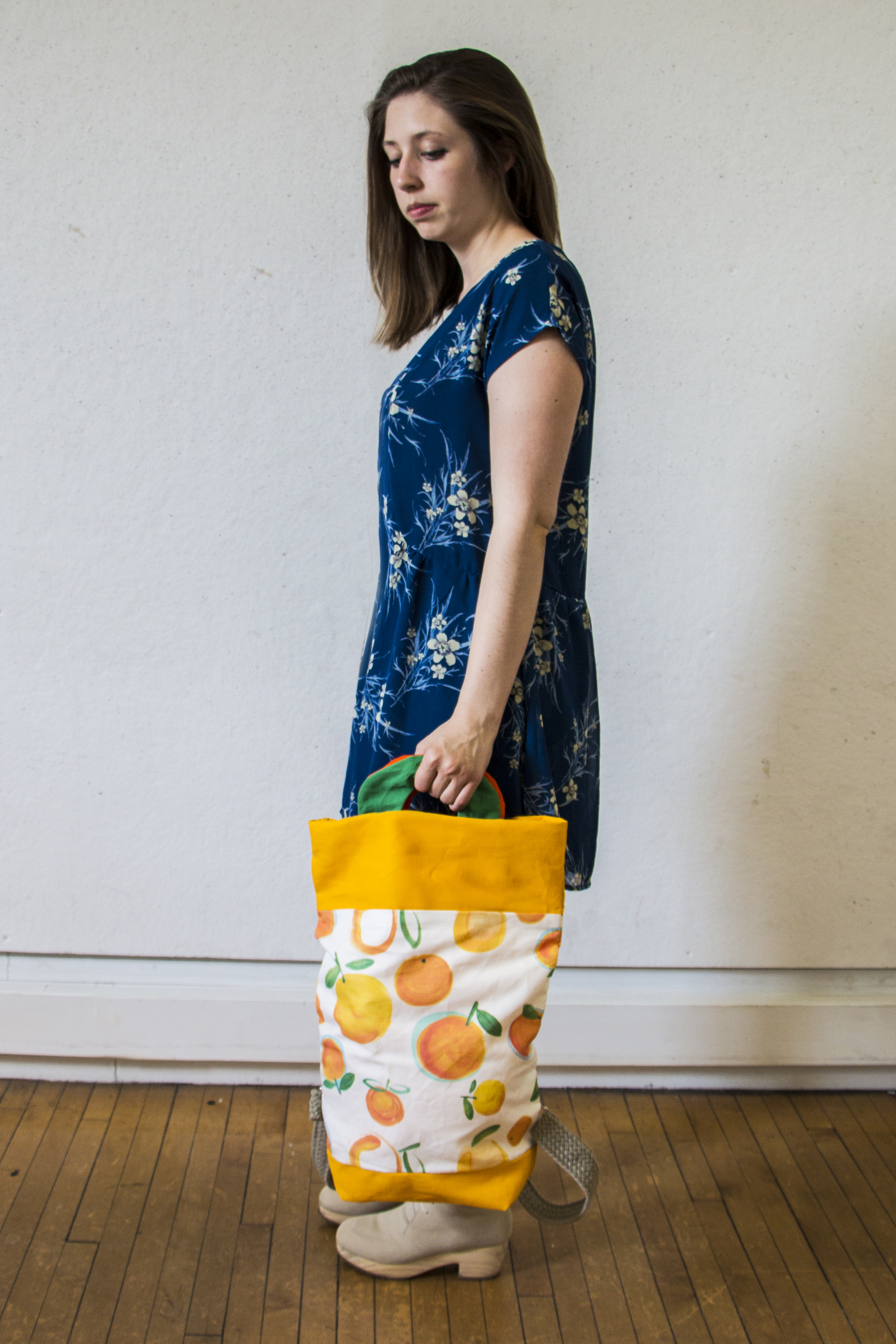
Having the final tangerine pattern printed on fabric, I made a backpack with it that has removable back straps, as well as extractable handles that can turn the bag into a tote.
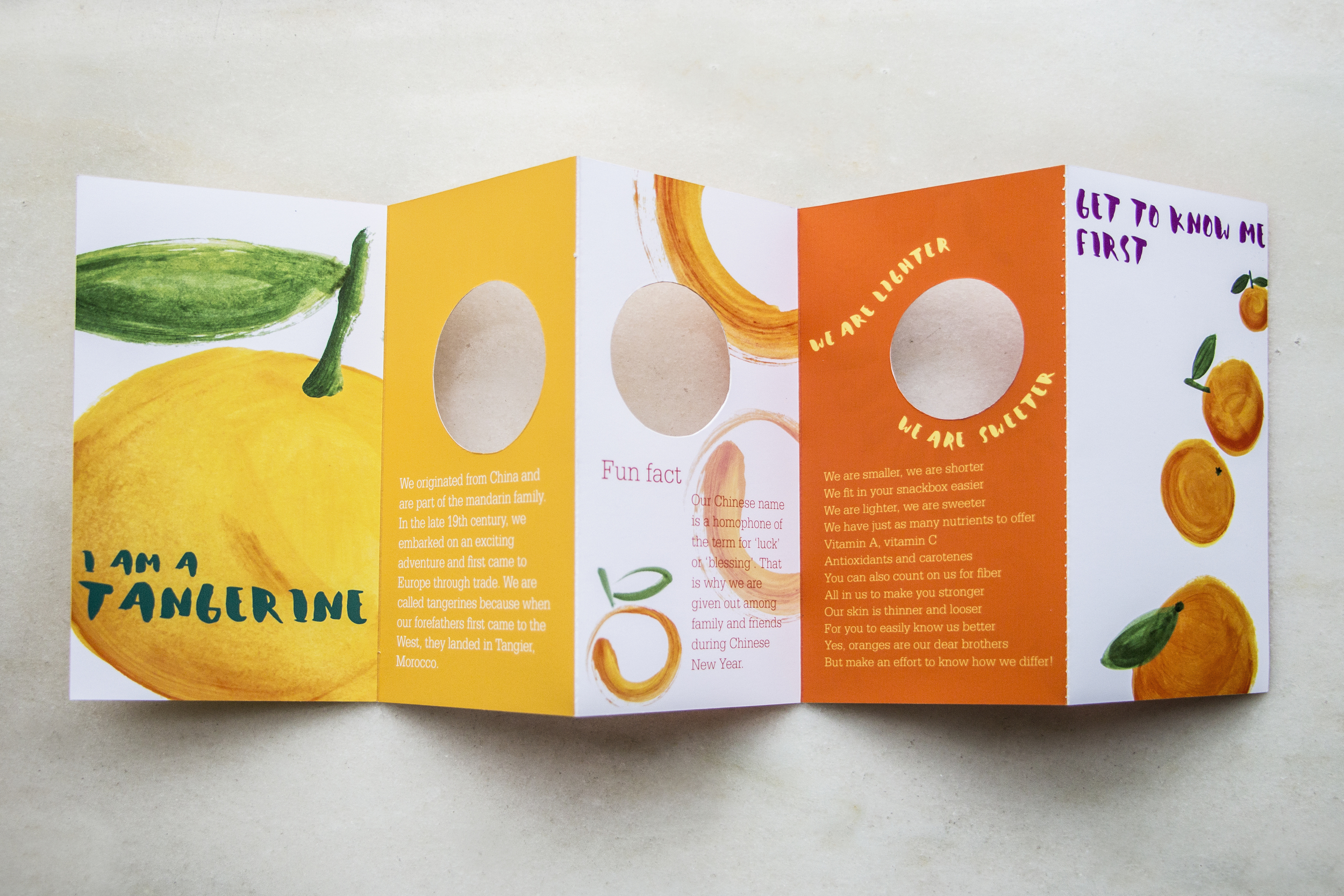
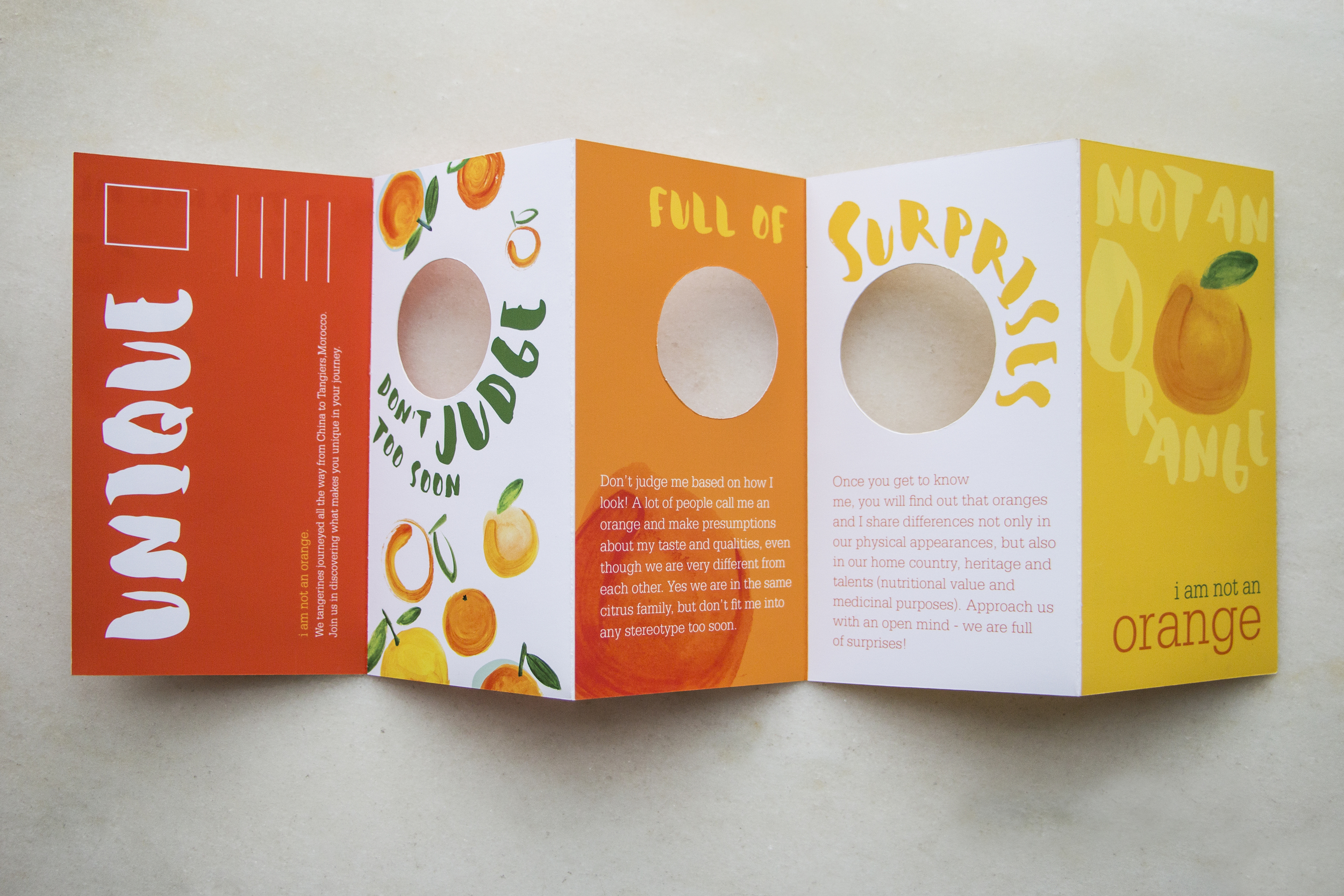
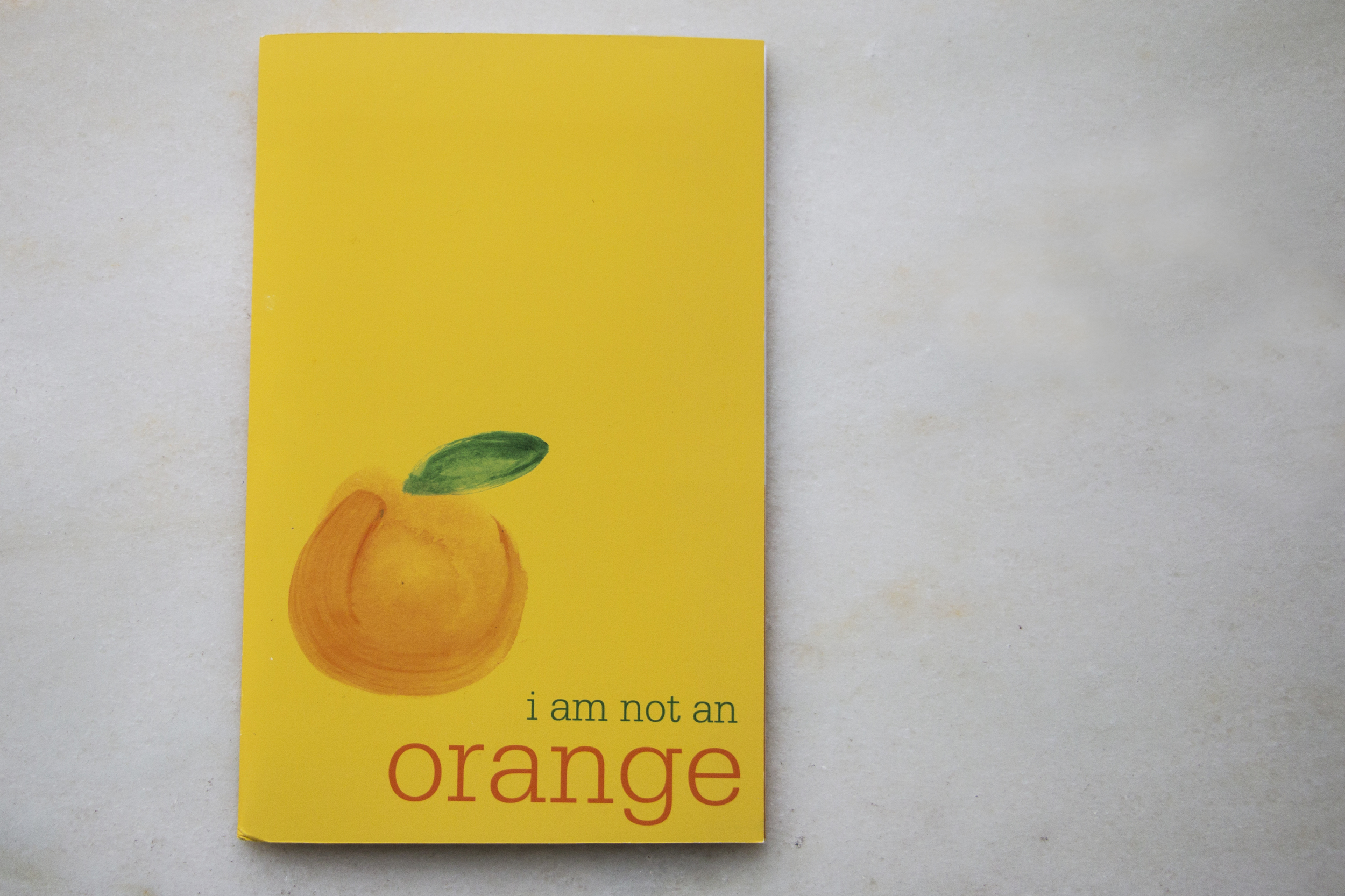
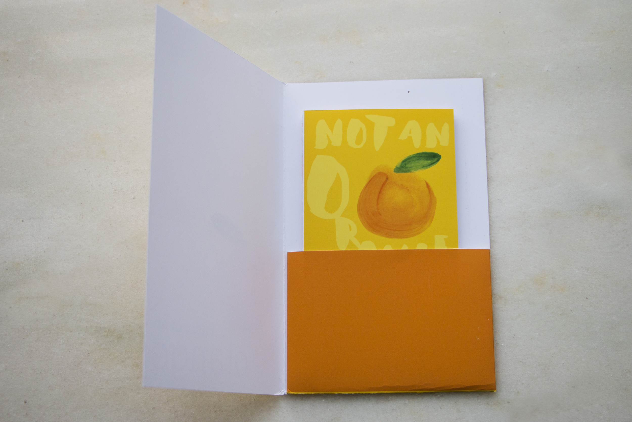
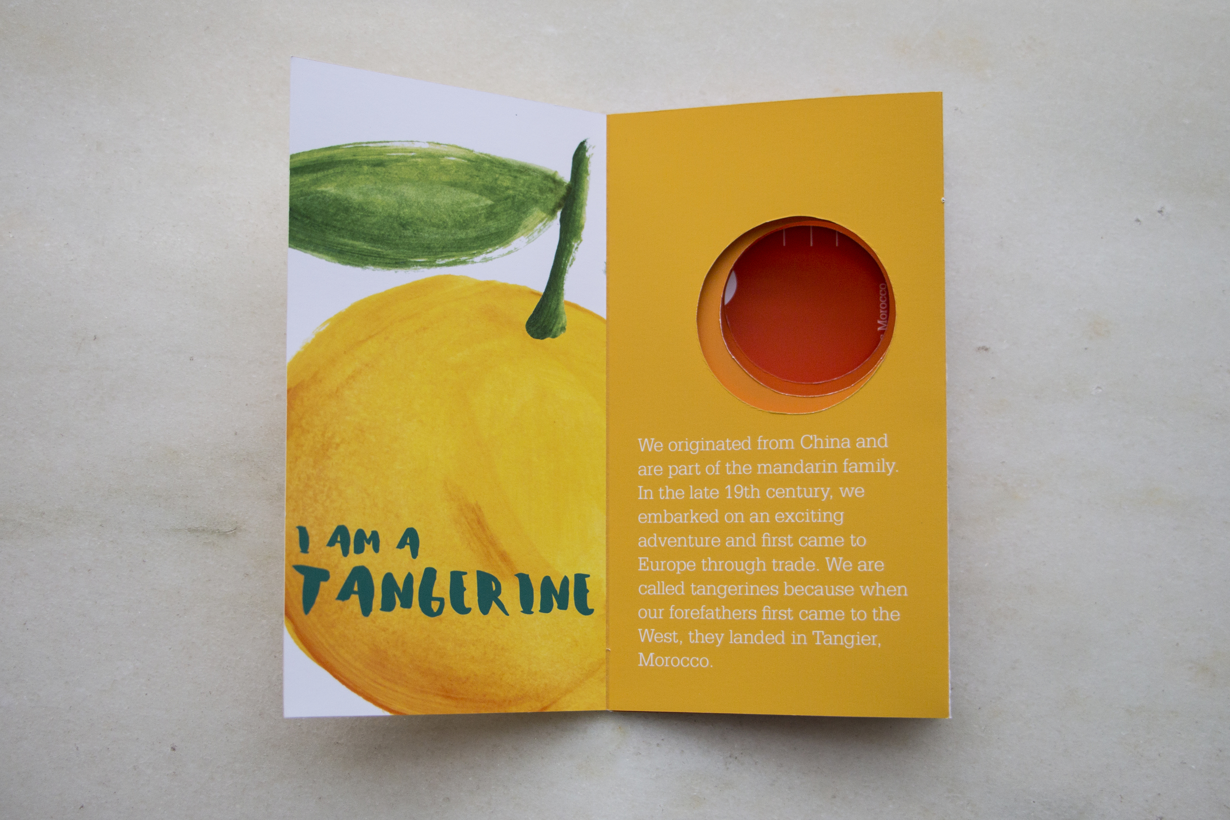
One thing about tangerines that has always made me curious is the fact that most people just call them oranges, when they are clearly different. All the different orange-colored citrus fruits like mandarins, tangerines and clementines seem so similar and are interchangeably referred to, yet they each look and taste somewhat different. Using this observation as a springboard, I base my branding system on the concept, “I’m not an orange”. The five-panel packet introduces the origin of tangerines and the differences between oranges and tangerines. It also includes a fun poem and stories recounted from the perspective of the tangerines, asking people to first understand them before putting them with any labels. The last panel of the packet can be torn off as a postcard.
As a whole campaign, I even made tangerine juice to be a part of the brand’s promotion!


